
Nature & Fresh
Case study
Overview
Nature & Fresh is a local organic brand dedicated to spray-free farming to grow the finest organic macadamia nuts in New Zealand.
My role was to help the brand launch their physical products into the marketplace and online store. I was responsible for the art direction, brand identity, wireframing, prototyping, visual design and front-end developments.
Deliverables:
Branding & Identity Design
Packaging Design & Production
Video production
User Experience Design
User Interface Design
Challenge:
Help Nature & Fresh become the brand it deserves, increases product sales and brand recognition, and open new streams of revenue.
Discovery
Mark from Nature & Fresh started out offering organic macadamia nuts and quickly expanded into other parts of New Zealand and Australia. Due to the popularity of the product, the business needed a packaging redesign and an online store to be the ground floor for their brand refresh.
A discussion and onsite tour of Mark’s inspiring organic farm helped me understand the business philosophy and the effort required to be organically certified.
Naturally, the product already differentiated itself from others, so the challenge was to be able to establish trust and credibility. Storytelling is a great way to paint an image of the brand and captivate the audience.


Transparency is key
The study suggests that consumers place a high value on traceability, as they were increasingly unhappy with “anonymous, homogenous organic food products” produced under potentially dubious social conditions.
Another study done by Lable Insight found that 94% of consumers are more likely to be loyal to brands that commit to full transparency. Almost 40% said that they would pursue new brands to gain more transparency.
To achieve that, we decided to highlight the product’s origin details and document the product making process to promote product authenticity.
Bibliography: Transparency market research, Label Insight
Brand strategy
The world of snack foods is crowded with competitors, and we needed to distinguish Nature & Fresh strategically.
Three brand attributes were defined during a stakeholder alignment session; organic, ethical, honest characteristics signify what the brand stands for, and the fundamental aspects of Nature & Fresh’s approach to their products, visually and emotionally.
Brand identity
The original Nature & Fresh’s logo is minimal and basic, it’s usable but not memorable. The business was ready for a logo refresh, the process started on paper, selected concepts are executed digitally. Two final refined logos were selected and tested with user groups from various demographics, locations, and other attributes. Questions were designed to measure metrics around:
Appeal
Ease of identifying
Purchase motivation
Relevance
Uniqueness
80% of users were more satisfied with option A than option B in a randomized presentation by at least two points on a five-point scale.


Packaging
As a snack brand, we wanted to ensure the freshness is protected to provide the highest quality product to the customers, a resealable packing is used to increase shelf-life and prolong the snacking experience, keeping it fresh and ready for the customer to enjoy the great tasting, healthy snack.
With the combination of the type pairing, custom hand-drawn illustration, product backstory and the earth tone colour palette found in nature, the visual language created a strong brand identity with a high shelf impact.
Velvet coating and organic badge add premium cues to the quality of the product that would appeal to the customer looking for that special offering or gifting.
Online store
Once the packaging design project is completed, the brand quickly moved onto the next mission to bring their product offering into the digital world, which is a great opportunity to carry over the established brand identity to their online experience.
A customer journey map is created to explore opportunities and actionable plans to help understand how customers find and interact with the online store.
The problems were broken down into key objectives. We ask ourselves: How might we...
Create emotional connections with user
Make purchase experience effortless
Create an end-to-end experience that delights user and earn customer trust.

Causing delight
To showcase organic farming, I produced a video featuring gorgeous footage of the animals living on the farm, product harvesting and making process, which told small stories of the organic farming lifestyle, creating strong emotional connections between the customer and the brand.


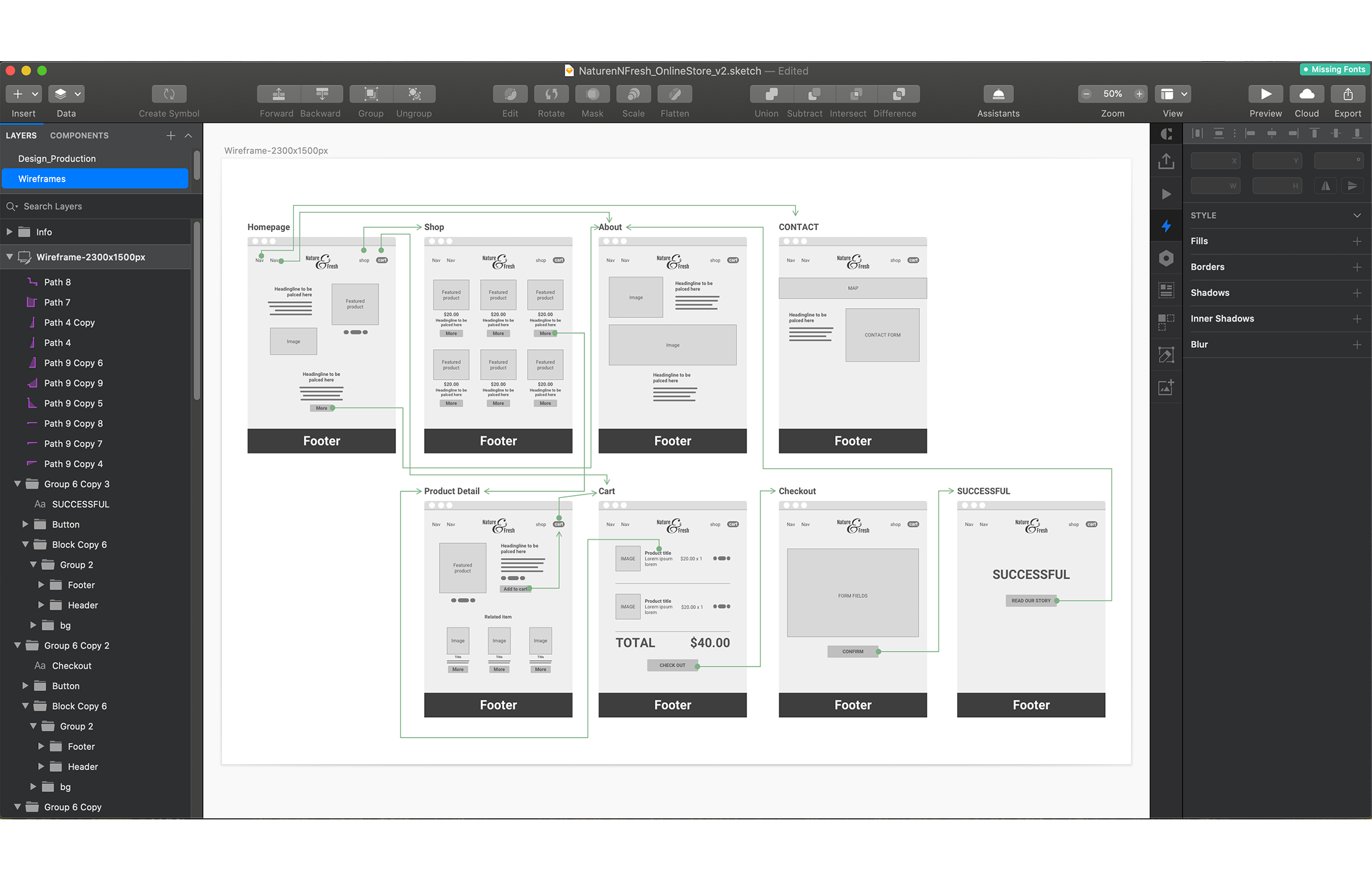
Wireframes
Paper wireframes were developed in Sketch followed by an Invision interactive prototype. Problems, assumptions and hypotheses were formulated before landing on the optimal solution.

Front-end development
Additional touches of component transitioning created an added layer of polish to direct user attention and enhance the overall user experience.
During the last stage of the development process, I used my background in the front-end and collaborated with the developer to contribute to the front-end coding, making sure the design is fully translated onto the front-end and uniformed across browsers, tablets and mobile screens responsively.
Test, Iterate, Launch
Final designs were built in WordPress, integrated with WooCommerce, the highly customised Wordpress CMS makes creating and editing product a very simple process, features such as adding discount and coupon to the product adds to the flexibility for the business to be able to create marketing promotions on the fly.
The website is optimised responsively to different devices, micro-interactions and animations is employed to create delightful moments. Special attention was given to the colour palette, typeface pairing combinations and custom iconography which defined Nature & Fresh’s brand identity.

We focused on creating a memorable visual identity that tells a cohesive story from print design to digital experience across web and mobile, during the design process, a lot of attention has been given to the packaging experience and online store presentation to maintain that organic feel to engage and encourage user to explore further down the page.
Since launch, business has received largely positive feedbacks with their new brand identity and opened up potential business opportunities and exposures.