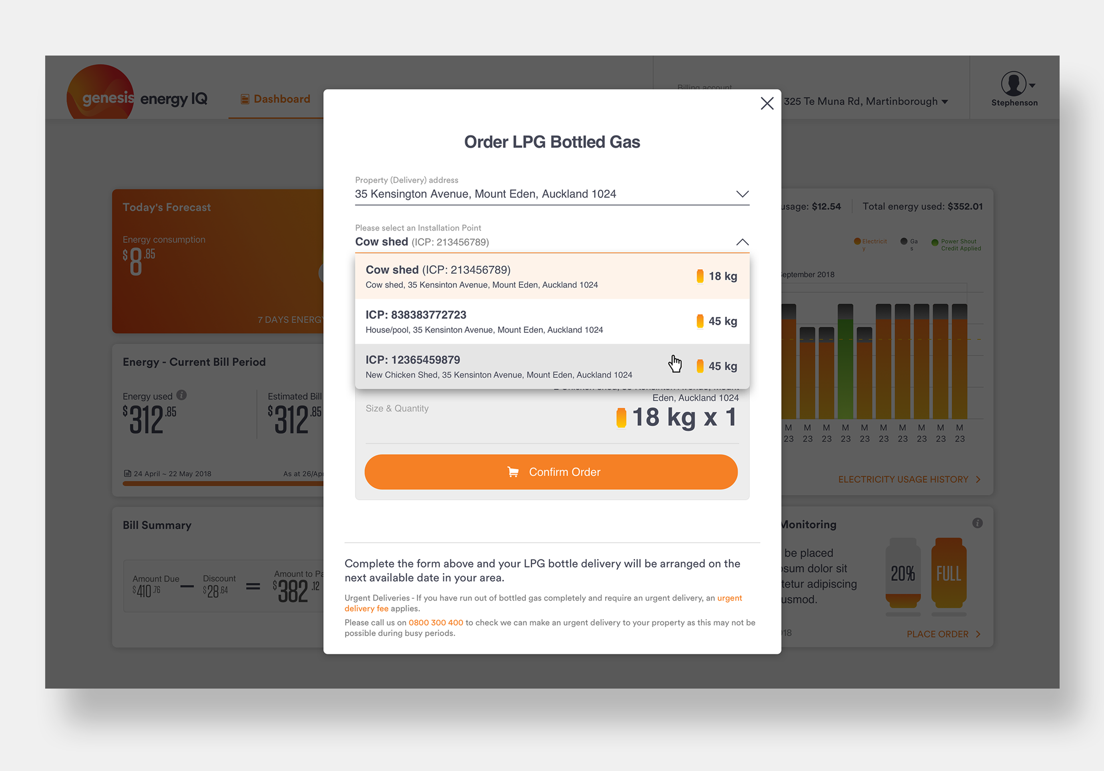
Energy IQ | LPG Bottle Ordering
Overview / Background
New Zealand relies on two primary gas types for household energy needs: natural gas and LPG (liquid petroleum gas), a cost-effective solution for homes without natural gas access. Based on the Power BI data, the most residential users run 2x 45kg LPG bottles, with one serving as the primary supply and the other as a backup. On average, these bottles last about 30 days for over 80% of users.
The existing LPG ordering process required repetitive inputs, causing friction and reducing customer satisfaction. My challenge was to simplify the LPG bottle ordering experience in the mobile app while establishing feature parity with the web platform.
Length of Project: 2 weeks
To comply with my non-disclosure agreement, any confidential information is omitted in this case study.Understanding the Process
To identify pain points, I analyzed the LPG bottle replacement journey:


Most households typically run 2x 45 kg bottles at a time so you have a backup when one runs empty offering an uninterrupted supply.
One bottle (primary) provides the main supply and the other (reserve) is a backup that provides extra gas when required.

When the primary bottle empties, the automatic regulator switches to the reserve bottle, with an indicator turning red.
Users typically order replacements manually, often unaware of how much gas remains or when to reorder.
This presented an opportunity to utilize automatic regulator data for proactive notifications, enhancing the experience with timely reminders and monitoring tools.
Define Objectives
Through collaboration with stakeholders, I established the following goals, framed as “How Might We” questions to focus ideation:
Effortless Ordering: How might we make the ordering process seamless and intuitive?
Leverage Technology: How might we use automatic regulator data to monitor gas levels and provide timely reminders?
Increase Online Conversions: How might we encourage more online orders while reducing call center inquiries?
Earn Trust: How might we create an experience that fosters customer trust and loyalty?
Ensure Consistency: How might we align the web and mobile app experiences for feature parity?
Wireframes and Iterative Design
Reduced Friction: Autofill functionality was implemented to prepopulate delivery information using existing user data, allowing purchases to be completed in seconds.
Heuristic Evaluation: Limited by time and resources, we performed heuristic evaluations with users instead of extensive testing to quickly identify and resolve usability issues.
Collaboration: Validated designs with the development team to ensure feasibility and alignment with technical constraints.


Gas Monitoring Dashboard
Designed a gas monitoring widget to provide real-time updates on gas levels.
Integrated notification messages to alert users when it’s time to replace bottles.

Simplified Ordering Process
Enabled users to seamlessly associate delivery information with their address and installation points, with the flexibility to switch between multiple sites if needed.
Ensured the process was minimal, intuitive, and aligned with existing design patterns.
UX Product Specifications
To streamline the Designer-to-Developer handoff, I created detailed UX documentation including interaction notes, transition guidelines, and design specifications. This ensured clarity and consistency during development and prevented scope changes from derailing the process.

Ordering Made Simple
The redesigned LPG ordering feature received positive feedback from users, significantly improving the experience by making it simpler, faster, and more intuitive. By leveraging connectivity and automatic regulator data, we transformed a previously tedious task into a seamless and delightful experience, fostering trust and boosting online order conversions.


Positive Results
The LPG ordering feature is well received and has had a positive impact on the LPG ordering experience.
For confidentiality reasons I have omitted reviewer's fullname. 
