Power Shout | Loyalty programme
Case study
Summary
Building on the success of the Power Shout loyalty program, Genesis Energy launched Power Shout 2.0, a revamped system designed to give customers greater control and flexibility over their energy usage. This enhanced loyalty program allows customers to earn Power Shout hours through various means and provides Genesis with a platform to deliver personalized rewards through quarterly marketing campaigns.
Power Shout 2.0 empowers customers to use their earned hours in ways that best suit their needs. For example, they can save hours for winter to offset heating costs, use them during a cold night, or apply them when running energy-intensive appliances like a clothes dryer. This flexibility ensures that the program aligns with customers’ lifestyles and energy habits.
The Energy IQ (EIQ) platform was identified as the primary tool to give customers visibility into their Power Shout balance and enable seamless access to their earned hours.
Length of Project: 6 months
To comply with my non-disclosure agreement, any confidential information is omitted in this case study.Customer Insights and Feature Development
In January 2020, Genesis conducted a comprehensive survey with 1,073 customers, 92% of whom had previously used Power Shout. Insights from this study shaped the key features for Power Shout 2.0, emphasizing:
Rewards for customer loyalty and regular bill payments to drive engagement.
Tailored campaigns to surprise and delight different customer segments.
Transparent Power Shout balances and clear redemption options.
Simplicity in scheduling free power hours, allowing customers to easily plan based on their needs.


“ First requirement for an exemplary user experience is to meet the exact needs of the customer, without fuss or bother ”
Exploration and Ideation
The design process began with multiple UX workshops to align priorities, review deliverables, and establish clear milestones. Quick sketches and wireframes were used to visualize ideas and develop a high-level user flow. This iterative process shaped the vision for Power Shout 2.0, ensuring every feature met user needs and business objectives.


Shaping Product Vision
Pragmatic goals and feature summaries were developed in collaboration with the business and technology teams. These sessions identified potential UX challenges, enabling the team to craft focused strategies for feature implementation.

User Testing and Insights
Following the rapid wireframing and prototyping phase, a usability test plan, along with screener questions and usability test scripts, was quickly developed to identify problems, uncover opportunities, and learn about target users’ behaviour and preferences.
Two rounds of usability testing were conducted with 20 participants using Figma Prototype and Askable.
Actions customers are ready to take:
Identify best time to suit their schedule
Edit/ Delete booking if schedule changed
Learn more about ways of earning Power Shout
Make a booking
Improvements oppotunities:
Revise Balance History description for clarity and visibility.
Display current balance during the booking process.
Provide estimate usage/cost in "Choose a Time" section.
Clarify terminology: Power Shout Currency vs. Power Shout balance.


Putting It Together
After conducting user testing sessions and gathering valuable insights, the designs undergo an iterative and meticulous refinement process to address and resolve usability issues.
A design system has been implemented with detailed UX specifications to support and clarify the design decisions to ensure consistency across the user experience. The documentation includes a dashboard, a booking system with notification and redemption functionality, and other features.


Purposeful Friction
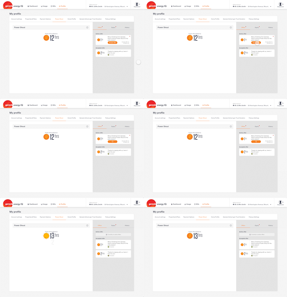
To make Power Shout offers more engaging, the experience included purposeful friction. Instead of automatically applying free power hours, users could actively accept offers in Energy IQ, creating a sense of ownership. Animated UI elements added delight, making interactions a dynamic and memorable experience.


Power Shout Hour bookings
The redesigned booking feature offers users a calendar view to schedule Power Shout hours effortlessly. To enhance the booking experience, the following actions were taken:
Clear labeling of pre-booked dates and available times.
Intelligent default settings for next available hours.
Transparent balance visibility during booking.
Prominent display of active and upcoming bookings for easy management.
These features simplified the booking process, placing user needs at the center of the experience.


Introducing Power Shout 2.0
Power Shout 2.0 is a user-centric loyalty program designed to enhance customer satisfaction and convenience. From personalized notifications to a streamlined booking system, every element was thoughtfully crafted to guide users through the journey seamlessly. The result is a more engaging, flexible, and rewarding way for Genesis customers to manage their free electricity hours, ultimately strengthening brand loyalty and satisfaction.


Power shout continue to be one of the key offering for Genesis products.
