Crypto Community Experience
Dacxi Overview
Dacxi, a fintech company, is dedicated to empowering users in the world of cryptocurrency. In 2018, I joined Dacxi as the Lead UX Designer, collaborating with an Art Director and UX Strategist to craft a seamless and engaging online community platform from the ground up. This platform was designed to provide crypto newcomers with a friendly, informative space to learn and share their investment experiences.
Our team worked under intense time constraints, successfully delivering high-fidelity prototypes and designs ready for development within two weeks.
To comply with my confidentiality agreement, I have omitted and appropriated confidential information. 
The Challenge
The project had a demanding timeline, requiring the delivery of a responsive high-fidelity prototype to our technical production partner within two weeks. This included:
A discovery and ideation phase to define user needs and business goals.
A two-day design sprint led by the UX Strategist, which identified key milestones and prioritized functionality for the initial release.
A rapid prototyping and design phase to produce ready-for-development outputs.

Understanding the Users
The Dacxi community platform was envisioned as a hub for cryptocurrency enthusiasts and beginners. We created detailed user profiles to better understand:
Demographics and psychographics of the target audience.
User behaviors, goals, and pain points.
How the platform’s brand should look, sound, and act to resonate with its users.

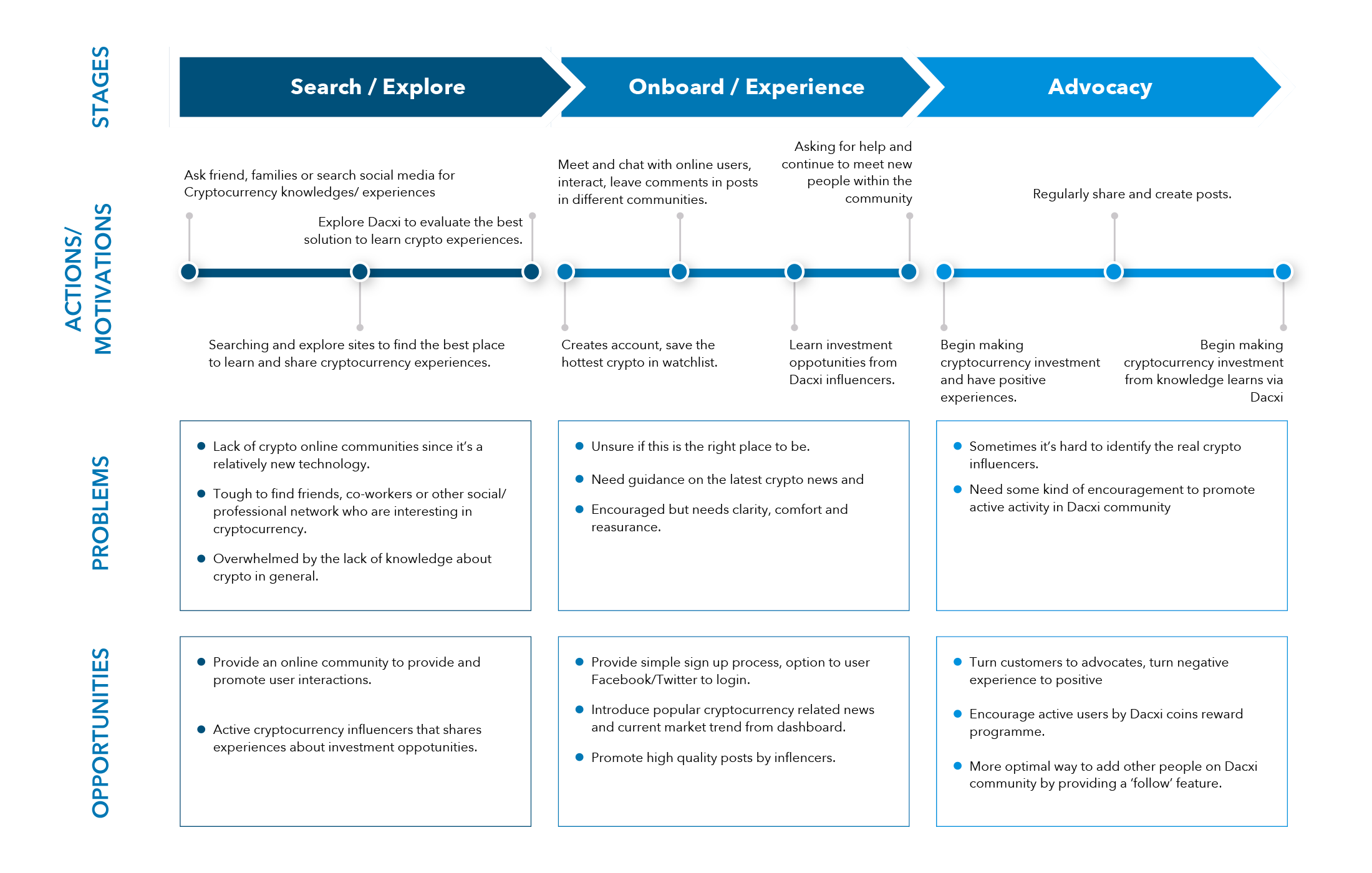
Experience Mapping
Adopting a lean UX approach, we conducted an experience mapping exercise to:
Identify user behaviors and challenges.
Define core functionalities required for the platform.
Establish navigation and interface requirements.

Wireframing the Flows
We used a mobile-first approach, focusing on essential features to address critical user needs. This method helped us design the core of the user experience and ensured scalability to other devices. By keeping scenarios at a high level, we maintained flexibility and explored concepts that shaped the platform’s backbone.

Product Specifications
To streamline collaboration with the overseas development team, I created detailed product specifications that included:
Interaction intent and flow visualizations.
Guidelines for transitions and interface behavior.
This documentation ensured the final product met both user needs and business requirements, minimizing miscommunication during development.

Unifying the Design Language
As we progressed, I delivered an extensive design system with a unified set of rules. This was to ensure brand identity is consistent throughout various touch-points. The design system also served as a Sketch Library. This will allow the future design team’s work to grow and evolve over the coming years.

Visualizing the Platform
Understanding that content would evolve constantly, we implemented a modular design approach with bite-sized information containers that could adapt to various layouts. Key features included:
Flexibility for endless layout possibilities.
Moderator tools to promote high-quality content.
Fully responsive designs optimized for both mobile and desktop users.


Key Outcomes
Responsive Design: Ensured seamless functionality across screen sizes, enhancing the user experience on both mobile and web platforms.
Flexibility and Modularity: Delivered a robust design system that allows the platform to grow and adapt over time.
Effortless Collaboration: The detailed product specifications facilitated smooth communication with the overseas development team, ensuring high-quality implementation.
